New Issues: Centenary of the birth of Queen Elizabeth II
- Xanthe Page

- 6 minutes ago
- 9 min read
On 21st April 1926, a baby was born. Her parents were the Duke and Duchess of York. No-one at the time expected that the Duke of York would become king, and definitely wouldn't have imagined that the baby would become the longest-reigning queen in world history.
Queen Elizabeth II died in September 2022 and there were several stamps issued to celebrate her life and reign. Not surprisingly, there will also be stamps to mark what would have been her 100th birthday on Tuesday. As you would expect, Royal Mail, the Isle of Man and Jersey have all created new stamps for the anniversary, and so have one or two other countries. Some are also being released on Tuesday while others are already issued and available to buy.
Let's take a look at them.
GB

Design Quality: Eight stamps all showing photographic portraits of the Queen with a historical photograph in the background. The stamps follow her life from a young child to an elderly lady. Four of the stamps are black and white (roughly the first half of her life) and the other four are in colour - a very striking contrast.
There is nothing on the stamps to say "100th anniversary", just "1926-2022". This makes the stamps feel tidy and uncluttered, and lets the photographs speak for themselves. However, while it's a good tribute to the Queen it isn't obvious these stamps are marking what would have been her 100th birthday.
I was not expecting much as recent Royal Mail issues celebrating the Queen's life haven't been very adventurous. But these are nicely done and they feel different and more personal. 8/10
Theme/Subject Choice: The Queen was obviously a hugely important person in UK history. It wouldn't have felt right NOT to mark the 100th anniversary of her birth. 10/10 Historical and Cultural Relevance: There's clearly very historically relevant as the Queen was head of state for over 70 years and the historic photographs on the stamps show moments from her life. 10/10
Innovation and Creativity: These are not hugely creative but they are an improvement on the 2022 issues that marked the Platinum Jubilee and the Queen's death. 7/10
Collectability: Royal stamps can be collectable and this is a major anniversary of the world's longest-reigning queen. 8/10
Personal Appeal: I like this more than I thought I would. I really like the design and the way photographs have been used. This is the best Royal Mail issue of the year so far. 8/10
Overall Score: 51/60
ISLE OF MAN

Design Quality: Nicely designed, showing the Queen beside some of her outfits and also showing changes in fashion during her lifetime. 7/10
Theme/Subject Choice: The fashion legacy angle is very different. I think it works very well and also makes the stamps not only about the Queen but also about fashion history. 9/10
Historical and Cultural Relevance: The Queen was also Lord of Mann and the fashion angle definitely adds to the historic and cultural relevance. 9/10
Innovation and Creativity: The idea of focusing on fashion is definitely different. The way different element have been combined is quite creative. 8/10
Collectability: Royal stamps can be collectable and this is a major anniversary of the world's longest-reigning queen. 7/10
Personal Appeal: I have said these are different and also quite clever with the focus on fashion. However, I'm not really a huge fan. I would have preferred something showing the Queen's connections with the Isle of Man. 6/10
Overall Score: 46/60
JERSEY

Design Quality: This is a single £10 stamp (£10!!!) that shows the Queen on horseback at the trooping of the colour in 1951, the year before she became queen. On the left is a gold/yellow bar with the words "100 Years of Queen Elizabeth II", which is actually wrong as she sadly is no longer with us. If you were making a stamp to to celebrate 200 years since the birth of Queen Victoria, you wouldn't say "200 Years of Queen Victoria". It's bad English and if I wrote that at school I'd expect correction in red pen! The photograph itself doesn't really capture the Queen's personality in the way the Royal Mail set does - if feels like someone's said "find a picture of the Queen and add a gold bar down the left side." Simple designs can work but this just feels... well, uninspired. 2/10
Theme/Subject Choice: It's a good subject choice and I would have been surprised if Jersey hadn't marked the anniversary. They could have done it better and definitely could have made it more connected to Jersey as Queen Elizabeth II visited many times. The photograph of Prince Elizabeth at the 1951 trooping of the colour seems a very odd choice. 6/10
Historical and Cultural Relevance: Queen Elizabeth II visited Jersey many times and she is obviously historically relevant. It's an important anniversary and people in Jersey will feel a strong connection with her. But the photograph used has absolutely no historical connection to Jersey at all. 6/10
Innovation and Creativity: I cannot see anything creative or innovative in this stamp. It feels very lazy, as if whoever designed it really didn't care. 0/10
Collectability: Royal stamps can be collectable and this is a major anniversary of the world's longest-reigning queen. But at £10 for a pretty dull stamp I can't really see many people getting excited. 2/10
Personal Appeal: Not worth the price. I won't be buying it. 1/10
Overall Score: 17/60
AUSTRALIA

Design Quality: Here is how a simple design can work well! Carefully chosen photographs placed in a plain white border with the right amount of text! 9/10
Theme/Subject Choice: It is a good subject choice as the Queen visited Australia many times. 9/10
Historical and Cultural Relevance: These are historically relevant stamps but perhaps it would have been better to use at least one photograph of the Queen in Australia? 8/10
Innovation and Creativity: There's nothing very creative here, just good use of photographs and a basic design that works. 8/10
Collectability: These will be popular with people who collects Royal-themed stamps. They're nicely done and not too expensive. But do they really stand out from other Royal issues? 6/10
Personal Appeal: I think these are well designed, but I don't have any strong feelings about them. They're good... they just don't inspire me. 6/10
Overall Score: 46/60
DJIBOUTI

Design Quality: Here's an odd one. Djibouti? Why would Djibouti create a set of stamps to celebrate the British queen? The design isn't anything special. There are different styles of illustrations and I don't think they fit together very well. What works best is the picture on the minisheet with the Queen and the British flag in the background. 3/10 Theme/Subject Choice: Queen Elizabeth II was known around the world. But is she really a good subject choice for a stamp of a country she never visited? 5/10
Historical and Cultural Relevance: Of course the Queen was an important person in world history, but I can't really see much relevance to Djibouti. 6/10
Innovation and Creativity: I don't think this is very creative. It looks like the kind of thing that might have been put together without a lot of thought apart from the money that can be made. 3/10
Collectability: Royal stamps can be very collectable, but these don't stand out from the crowd. 2/10
Personal Appeal: I'm sorry. I just don't like these. 1/10
Overall Score: 20/60
GERMANY
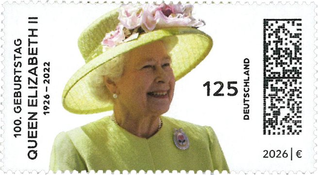
Design Quality: Another simple design that really works well. However the data matrix code on the right totally ruins it. 6/10
Theme/Subject Choice: It is a good subject choice. Queen Elizabeth II visited Germany many times and helped to fix relationships between the UK and Germany after World War II. Her first visit was a "reconciliation" visit in 1965. She was very well-liked and respected in Germany. 8/10
Historical and Cultural Relevance: As I've said, Queen Elizabeth II had an important role in reconciliation and she visited Germany many times. Deutsche Post's website says that the stamp "represents a tribute to her legacy, stability, and role in strengthening UK-Germany relations." 8/10
Innovation and Creativity: This isn't the most creative stamp, but it is simple and effective. 5/10
Collectability: These will be popular in both Germany and across the world. These stamps are in German post offices already and will probably be used on more items of mail in Germany than the Royal Mail stamps will be in the UK. 7/10
Personal Appeal: It's not a bad stamp at all and a nice tribute from Germany, but data matrix codes don't normally make a stamp more attractive. 5/10
Overall Score: 39/60
GIBRALTAR

Design Quality: Simple designs work! A white bar at the bottom with "Gibraltar" and "Queen Elizabeth II - 100 Years" gives the stamps a clean layout and the idea of showing Queen Elizabeth II at different ages is really strong and helps create a timeline. The colours of the photographs are nice and warm, and it all feels connected. But even a good design could be improved. The backgrounds look similar and the photographs are all "head and shoulders" portraits so while they show the Queen at different stages of her life we don't see the wider context as we do with Royal Mail's stamps, which show her at important events. Some of the portraits are clearly cropped from larger photographs, and I think Gibraltar's stamps could have told a story if they'd gone with the "bigger picture" idea. Also the younger photos look slightly out of focus and less sharp compared to the newer ones. 8/10
Theme/Subject Choice: As I have said for many of the other stamps, it is a good subject choice. Queen Elizabeth II only visited Gibraltar once, in 1954 as part of a Commonwealth Tour. However, she was respected in Gibraltar and of course she was its head of state for over 70 years. 8/10
Historical and Cultural Relevance: Yes, they're historically relevant because they show pictures of the Queen throughout her life. It could have been made more historically relevant by using photographs showing the Queen at important historical events, perhaps including her 1954 visit. 6/10
Innovation and Creativity: I don't think there is a lot of innovation on show although the design is neat and the timeline idea is quite creative. With tributes sometimes simple works better. 7/10
Collectability: I think these will be quite popular with people who collect Royal issues. They are really nice photographs of the Queen. 7/10
Personal Appeal: I have said that the design could be improved but these are my personal favourites. The photographs are beautiful and while the older ones are not quite as sharp as I would like it's a small point and they show a young girl/woman who looks happy. The soft colours are really good. They're not trying to be too clever, just real. I don't think the stamps are perfect but they are absolutely my favourite ones from the 100th anniversary issues and for that reason I am giving them full marks! 10/10
Overall Score: 46/60
NEW ZEALAND

Design Quality: The design is based on New Zealand's definitive stamps from the 1950s. Here is an example.

It's a clever idea to use old stamps to celebrate the Queen's life. The text on the stamps is carefully placed so it doesn't dominate. it also includes the name of New Zealand in Maori - Aotearoa. The four stamps basically show the same design in different colours, which might feel repetitive but as it is a tribute to both the Queen and her first New Zealand stamps I don't mind. These are colours that were used on some of those original stamps. 8/10
Theme/Subject Choice: It's a very good choice for New Zealand as Queen Elizabeth II had a strong connection to the country and visited ten times. She was actually the first monarch to visit New Zealand. 9/10
Historical and Cultural Relevance: Yes, this has a double relevance because of both the Queen's connection to the country and the classic 1953 definitive stamps. 9/10
Innovation and Creativity: The old definitive stamps have been used very creatively to make this fantastic tribute. 7/10
Collectability: These will be popular to people who like Royal themes but also people who are interested in the history of stamps. 7/10
Personal Appeal: I think these are very well done. I feel the designer has done a great job. 7/10
Overall Score: 47/10
I am surprised that Canada has not created a stamp for the anniversary as Queen Elizabeth II loved Canada and visited it more than any other country. I am also surprised that Djibouti has issued a set, but I'm guessing someone is thinking about the opportunity to make a bit of money? What is so impressive is that different countries have had different ideas about how best to celebrate 100 years since the Queen's birth. I think that New Zealand probably has the most creative take. Overall, my personal favourite is Gibraltar but I have given the highest score to Royal Mail's set which a lot of thought has gone into. It's very well done. Which of these do you like, and which do you feel is the best tribute?


Comments