New Issues: Winter Olympics (various countries)
- Xanthe Page

- Feb 8
- 11 min read
Updated: Feb 9
I have already reviewed the recent Winter Olympics issue from Estonia, but in the last few days there have been several other Olympic-related issues from various countries. I have decided to review these together.

The first one is this from Liechtenstein. It is a single stamp and reminds me of some of the historic Olympic posters. Design Quality - This feels like a classic poster from history. The Olympic flame stands out boldly against a dark nighttime background. It emphasises the flame but we also see a beautiful, peaceful alpine scene - I don't know whether it is in Liechtenstein or Italy, or even if it is a real location, but the design really says "This is the Winter Olympics!" 6/10
Theme and Subject Choice - The Winter Olympics is a major event. Historically Liechtenstein has done very well for a small country, winning ten medals, so it will be very important to them. 8/10
Historical and Cultural Relevance - Liechtenstein doesn't really perform too well in international sport, which is not surprising for a very small country... but it has often done very well at the Winter Olympics. The country has won ten medals, most recently in 2018. They will be particularly proud of their Olympic achievements and their team in Italy, so I think this makes the issue very relevant. 9/10
Innovation and Creativity - As I said, I think this takes some inspiration from classic designs of the past but it is still very effective. I feel it was quite a creative choice to combine a winter scene with the Olympic flame. 6/10
Collectability - Sports stamps, especially around the Olympics, are quite collectable. 8/10
Personal appeal - I like this because it does feel a bit "Liechtenstein", a bit traditional and a bit bold all at the same time. It is far better than a lot of the other issues that just seem to show generic images of athletes. At just £1.14 for the stamp, one of these will probably be added to my collection. 10/10 Overall score - 47/60

The next stamp is from Croatia. It has a 1980s feel to it. Design Quality - This is a very simple design. Simple designs can sometimes be very effective, but this one? I don't think so. It shows very basic figures using very basic colours. It shows the figures participating in four sports and the different colours might be about diversity... well, maybe. I can't say I like it. 4/10
Theme and Subject Choice - The Winter Olympics is a major event and Croatia always send a team. They did very well in 2002 but in recent years haven't won medals. 6/10
Historical and Cultural Relevance - A Croatian is at this year's Winter Olympics but football is a lot bigger in Croatia than winter sport. They haven't done so well in recent years. But I think any country sending a team to the games will probably want to show some pride in their team. 5/10
Innovation and Creativity - It's like something from the 1980s. it may have felt cool and edgy then but it doesn't now, it just feels boring and lazy. I'm being very generous here in giving it two out of ten. 2/10
Collectability - I think sports stamps will always be collectable, even if they're not well-designed. I am sure collectors of Olympic stamps will be interested, but it may not appeal to many other people. 6/10
Personal appeal - I don't really like this, although I think it is great that Croatia has created this stamp for the winter games (perhaps one day Royal Mail will too). I may buy this, but only to display with other stamps from this year's Winter Olympics. 3/10
Overall score - 26/60
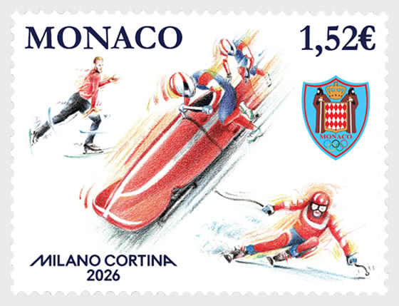
Then there is this one from Monaco, which uses generic pictures of athletes. Normally I don't like that, but here I think it works. Design Quality - This is a Monaco stamp and so we expect to see some intricate, detailed drawings. We see athletes taking part in three different sports and the artwork is as good as you would expect. It's not exciting or imaginative, but it is definitely well done. 6/10
Theme and Subject Choice - The Winter Olympics is the Winter Olympics - something that definitely deserves to be celebrated in stamps. Monaco always send a small team, but have never won a medal. 6/10
Historical and Cultural Relevance - Monaco have never done well at the Winter Olympics so there's no historical relevance, although no doubt people in Monaco will get behind their team. 5/10
Innovation and Creativity - It's in Monaco's typical style, which is beautifully done but not particularly innovative. I think the artwork is great but the artist hasn't been overly creative here. 4/10
Collectability - For all the reasons I've already listed, stamps about the Winter Olympics will always be quite collectable. I don't think there is anything about these that makes them especially collectable. 6/10
Personal appeal - I've said I don't think these are very creative and there is nothing special about the design. However, I really like these, simply because the artwork is so good. The generic athletes work, especially from a country that doesn't have any famous Olympians. 7/10
Overall score - 34/60

Slovenia has created a Winter Olympics stamp, which also has a basic design. Design Quality - This is another stamp with a simple design, but it is better than the Croatia stamp because it isn't too cluttered. It also is a more clever design, using angles to suggest going downhill and the thick coloured lines to show speed. The figure could be anyone - male or female. 6/10
Theme and Subject Choice - It's a good choice, especially for a country that has a successful team. Slovenia hasn't always done well at the Winter Olympics but they won seven medals in 2022. Slovenians will probably be hoping for another great winter games for their team. 7/10
Historical and Cultural Relevance - The Slovenian team wasn't always very successful but they won eight medals in 2014 and then seven in 2022, so it's fair to say there's some historical and cultural relevance to this stamp. 7/10
Innovation and Creativity - This feels like a design inspired by a different era. It doesn't feel fresh or innovative. I'm not excited by it, but it is fair to say that it's a solid design and I will give it some marks for creativity. 5/10
Collectability - It's another stamp that is collectable because it's an Olympic stamp and not because there's anything exceptional about the artwork or design. 6/10
Personal appeal - I don't mind this stamp, but it doesn't feel modern and it doesn't inspire me. 5/10
Overall score - 36/60

This one from Lithuania is another simple design that reminds me of historic posters. Design Quality - I like the historic poster feel, but this one hasn't been done all that well. The font is far more interesting than the main artwork. 4/10
Theme and Subject Choice - Like all the others, the Winter Olympics is a good subject choice. 6/10
Historical and Cultural Relevance - Lithuania has had a reasonably successful Olympic team, but this has never really transferred to their Winter Olympians. They've always sent small teams and have never won a medal, although they are sending their biggest ever team to Italy this year, which is maybe a sign that they're aiming to become more successful. Perhaps the stamp is reflecting this? 6/10
Innovation and Creativity - There's not much innovation or creativity here. There's nothing wrong with being inspired by classic designs, but this just feels a bit... well, flat. It is a poor imitation. 2/10
Collectability - As I've already said, Olympics stamps will always be quite collectable. 6/10
Personal appeal - I'm sorry, but I feel this stamp was a wasted opportunity to do something much better. 4/10
Overall score - 28/60

And there is this one from Switzerland, which is in comic book style. Design Quality - This Swiss stamp is like a comic strip! The post.ch website says that "it tells the story of the Winter Olympics Milano Cortina 2026 in small, dynamic sequences". The designer is Christoph Frei who has tried to "capture the essence of the games... the excitement at the start, the rhythm of the turns, the buzz of the fans and the weather, which can change everything at any moment... It preserves the unique atmosphere and central values of this global event: proximity, emotion, and stories that have meaning far beyond sporting competition". I think the comic strip idea works incredibly well and is a great summary of what the games are about. On the down side, it does feel a bit crowded but it does contain all the important ingredients. Maybe it would have been better to "tell the story" in two or maybe three stamps instead of just one? 7/10
Theme and Subject Choice - The Winter Olympics is a good subject choice and especially in Switzerland which has a massive winter sports tradition. 8/10
Historical and Cultural Relevance - This stamp is partly a tribute to the Swiss team and historic Swiss Olympians. Switzerland have an outstanding record in the Winter Olympics, and the stamp honours that. It would be hard to argue that the Winter Olympics aren't culturally and historically relevant in Switzerland! 9/10
Innovation and Creativity - This is a very creative stamp. The comic strip style has been used on other stamps, but I don't think it has been used for the Winter Olympics before. It was a great idea to try and tell the story on a single stamp, from celebrating the great Swiss team to the speed of the skiers and the people watching from all around the world. 7/10
Collectability - People will always want Olympic-themed stamps and this one is a bit different which I think will make it even more collectable. 8/10
Personal appeal - This is a fantastic stamp, well designed, imaginative and a great celebration of winter sport. Unlike the others, there is a clear sense of national pride in it too. The only thing I would suggest is perhaps it would have been better as a set rather than tying to put so much on one stamp. 9/10
Overall score - 48/60

The only country to use actual living athletes on their stamps is Poland. This is a very distinctive stamp that shows three of their Winter Olympians. Design Quality - At first, I thought this reminded me of the GB 1988 sports stamps, which were very colourful and blurred the athletes to show movement and speed. But I think this is definitely better and instead of simply being clever artwork it is actually based on photographs. The Poczta Polska website tells us: "The design for the issue was prepared in cooperation with the Polish Olympic Committee. It is based on photographs by Szymon Sikora, taken during a special photo session with athletes selected for the Polish Olympic Team." There was still a lot of work for the designer to do and they've managed to create something that feels almost alive! 7/10
Theme and Subject Choice - it's a great subject choice but even better because it honours three famous Polish athletes - Kaja Ziomek-Nogal, Maryna Gąsienica-Daniel and Konrad Badacz. Kaja is the person in the centre - she is a very talented speed skater who is the current European champion and a huge medal hope in Italy. Maryna is an alpine skier who came fifth in the World Championships and Konrad is a former Youth World Champion biathlete. 8/10
Historical and Cultural Relevance - It's celebrating the Winter Olympics and three very gifted Polish Olympians. The stamp tells us a lot about Poland's hopes for Kaja, Maryna and Konrad. So I'd say it's very culturally relevant. 9/10
Innovation and Creativity - Yes, this is one of the more creative stamps, using both photography and digital design techniques to make "dynamic shots that capture the pace and character of winter competitions, emphasizing their signature speed, precision, and technique." 8/10
Collectability - Very collectable if you like stamps about the Olympics or you happen to be a fan of these Polish athletes. 8/10
Personal appeal - An excellent stamp, wonderfully designed and a great tribute to Poland's start Winter Olympians. 9/10
Overall score - 49/60

It would be strange if Italy didn't create a stamp for the Olympics, and they haven't let us down. In fact, they have created two stamps. They are certainly very different! Design Quality - These are unique but at first it isn't obvious that they are about the Olympics. Fortunately, Poste Italiane explained what was going on in these stamps and what the meaning of these curious designs is. "The vignettes depict, on each stamp, a Vibe, the main element of the visual identity of Milan-Cortina 2026 and the official Look of the Games. Each Vibe is constructed from colours blending in gradients, from blue to magenta and azure, and from green to teal and yellow. Bright graphic signs emerge, traced by fluid and dynamic white lines, which move continuously across the image. These signs are not simply decorative elements, but the visual representation of the human gesture that expresses talent, creativity, and energy, components of the Italian Spirit of Milano Cortina 2026."
Well, that sounds very technical - but the main thing is that the Vibes are symbols of talent and energy. The design feels full of energy and power. However, without the explanation about the stamps' meaning, would anyone know what they were about? 7/10
Theme and Subject Choice - The Winter Olympics are in Italy for the first time in 20 years. That sounds like a pretty good reason to issue a couple of special stamps! 10/10
Historical and Cultural Relevance - It goes without saying that the cultural relevance is high. Italy is the host nation and clearly very proud of it. 10/10
Innovation and Creativity - They certainly feel energetic and creative, with plenty of dynamic movement and inventive use of colour. 7/10
Collectability - They're Olympic stamps issued by the host nation. 8/10
Personal appeal - This is a great set, and I like the Vibes. The design works well and these stamps definitely stand out. 8/10
Overall score - 50/60


Finally, Ukraine has gone all out for these Olympics, creating two minisheets.
Design Quality - Here are two very different miniature sheets with very different designs. I prefer the design of the second sheet, but both use generic sportspeople. The figures in the second sheet look like they are made from snow or ice. 7/10
Theme and Subject Choice - A good subject choice, especially when Ukraine have sent a team despite the problems back home. 8/10
Historical and Cultural Relevance - I see these as a celebration of Ukraine taking part in these games despite the ongoing conflict. 9/10
Innovation and Creativity - I think the designer (or designers) have tried to be creative, especially with the second sheet. Simple designs can work well, and I think these are better than the slightly more detailed and colourful design of the first sheet. 7/10
Collectability - They're already going for quite a lot of money on eBay. Why? Partly because of the Olympics, but I also think it's because of Ukraine. The stamps are a gesture of defiance, saying "We're still here and we're going to the Olympics". 8/10
Personal appeal - I'm not sure why they needed two sheets. I definitely prefer the second one and the two don't really fit together. Overall I like them and wish Team Ukraine best of luck in the games. 8/10
Overall score - 47/60
So that is my review of the Winter Olympics stamps - there are some very good issues in there and some that are not quite so good but overall I think they make a great little collection.

Finally there is this miniature sheet from France. I said earlier about the Lithuania stamp that "I like the historic poster feel, but this one hasn't been done all that well". Well, here is one that has that same feel but is far more effective! Design Quality - This is like a classic poster with the mountainous background, a distinctive old-school font and - in the foreground - some stylised images of sportspeople. They're clearly not realistic and haven;t been designed to be, but the figures are sleek and elegant. It feels sophisticated. 8/10
Theme and Subject Choice - The title of the set is "Winter Sports Season 1" and the stamps aren't specific to the Winter Olympics, but they have clearly been designed with the Olympics in mind. Winter Sports is big in France. 8/10
Historical and Cultural Relevance - France is very proud of their winter sports, although they have created many similar stamps in the past. Timing this to coincide with the Olympic Games makes sense. 6/10
Innovation and Creativity - This feels inspired by old styles while also being a very clever example of modern graphic design. There is nothing wrong with the old and new ways coming together like this. 7/10
Collectability - The fact they're not specifically Olympic stamps means that Olympic collectors will give them a miss. Still a very classy sports issue and should have a wide appeal. 6/10
Personal appeal - This has been very well done and shows that in design less is often more. 7/10
Overall score - 42/60


Comments