Duck Tales on Stamps
- Xanthe Page

- Sep 8, 2025
- 7 min read
Updated: Sep 9, 2025
This week Royal Mail will be releasing a set of stamps featuring British ducks. They're very nice and I will be reviewing them in a few days. However, it got me thinking: have Royal Mail ever dedicated a previous issue to ducks? The short answer is no. They did create a nice set featuring swans in 1993. But ducks? Not at all. Despite issuing several general bird-related stamps down the years - 1966, 1989, 2007 and 2011 (post & go) - none of these have ever carried a picture of a duck. In 1996 the Wildfowl and Wetlands Trust issue had a 19p value carrying a picture of a young Muscovy Duck and in 2005 there was one as part of a set of farm animals, but that is all!
It's hard to believe that ducks haven't been on our stamps more often. What could be more British than ducks? It seems ridiculous when multiple stamp issues have been dedicated to Star Wars (four!) and Harry Potter (three!) that our feathery water-loving friends have been almost totally forgotten. It's not only here in the UK though. There have been several stamps showing ducks issued by countries around the world, but often these are part of a wider set of bird-related stamps and sometimes even definitives. It is more unusual to see an issue focused only on ducks.
I've had a look at some of the best duck stamps and offer my views on them.
I believe that a duck first appeared on a stamp in 1934, when the US issued its Federal Duck stamp. That seems like a pretty good place to start!
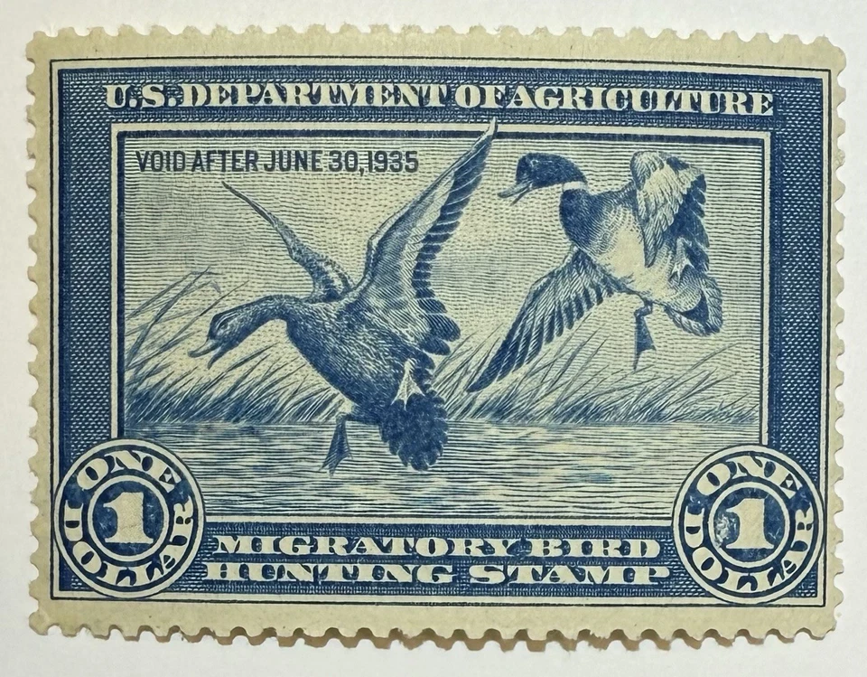
US Federal Duck Stamp (1934). This was the first time that ducks appeared on a stamp, but it's important to note that this was not a postage stamp and would not have appeared on mail. These stamps were created by the US Department of Agriculture and had to be bought before hunting any migratory wildfowl. The stamp makes this clear and the text reads: "Migratory Bird Hunting Stamp". Congress passed an Act - called the Duck Stamp Act - and the stamps have been used ever since.
The first stamp shows two mallards flying over a lake. It was designed by Jay Norwood "Ding" Darling. He was a friend of Walt Disney and a conservationist. I really like the design and the illustration, which has become iconic over the years. There have been many different duck stamp designs but this really is the best. Score: 10/10

Antigua and Barbuda (1995) - $6 minisheet. I'm not sure why they had to create a miniature sheet for this when the entire picture could easily have fitted on a stamp. Remove the stamp from the sheet and it doesn't look great. The stamp/sheet shows a male and a female blue-winged teal. The illustration is pleasant but I wouldn't say it is striking or memorable.
Score: 4/10

Ireland (1996). This set showed ducks native to Ireland and included their Latin names and their Gaelic names, but not their English names. Spadalach is a shoveler, Rualacha is a wigeon, Mallard is (unsurprisingly) a mallard, while Praslacha is a teal.
Both the males and the females are shown.The birds are drawn in pairs on each stamp, which makes them feel more alive, like they’re hanging out together instead of just posing. The watercolour paintings make the pictures appear calm and peaceful.
Overall, I'd say this is an impressive set and one I would like to add to my collection.
Score: 9/10

Falkland Islands (1999). The Falkland Islands often create exceptional stamps and are famous for their innovative design. This is another very good production from them. The set of six stamps shows ducks that can be found in the Falklands: Chiloé wigeon, crested duck, brown pintail, silver team, yellow-billed team and flightless steamer duck.
The artwork is very well done. The background is a soft blue that makes the ducks stand out really clearly, and each one has a little bit of water or grass so it feels like each duck is in its natural spot. The drawings are really detailed, like you can see all the feathers, but they don’t look cartoony — more like in a nature book.
Score: 6/10

Åland (2001). These Åland stamps look really bright and lively! Instead of showing different ducks, all four stamps carry pictures of the Steller's Eider. Like the Ireland and Falklands stamps, the ducks have ben painted in great detail The natural colours of the duck are bold which helps - the ducks pop out right away against the softer water and sky backgrounds. Each stamp feels like it’s showing a different little “moment” of the bird’s life — swimming, flying, or just floating — which makes the set feel almost like a mini story.
The WWF panda logo in the corner makes them feel important, and shows the set isn't just about ducks but protecting nature. Overall, these stamps feel like snapshots from a documentary about a duck's life.
Score:10/10

Ireland (2004). This is another set from Ireland but they look a but different to the 1996 issue. The design here is simpler, with each bird shown on calm water against a mostly plain background. That makes the ducks really stand out, almost like portraits. The colors are still soft and natural. The focus is on the duck - not the scenery or what it is doing as in the Åland set.
Compared to the earlier Irish stamps (the ones with pairs of ducks and grassy backgrounds), these feel more “formal” and neat, like they’re showing off the bird in a clear way for you to study. The photographs are the kind of thing you'd expect in a birdwatching book to help you identify birds.
Unfortunately, these show only a male duck for each species. The names are still in Irish but the Latin names have been replaced with English ones. The ducks shown are the tufted duck, merganser, gadwall and garganey.
Score: 10/10

Jersey (2004). This set shows ducks and swans, but I still felt we should include them. These are from Jersey stamps are really bright and colourful and use different background of green blue, pink and yellow to make the ducks really stand out in a dramatic way.
Each bird is shown super clearly, floating on water with shiny reflections. It makes the stamps eye-catching. They're not like the natural style paintings or photographs used on other sets, and are very distinctive.
Score: 9/10
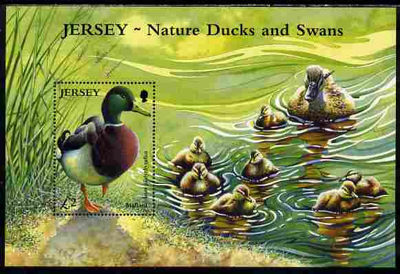
Jersey (2004) - £2 minisheet. This Jersey sheet feels more like a full painting than just a stamp. The main stamp shows a male mallard standing by the water, but the whole background scene continues across the sheet — with the ducklings swimming toward their mother in glowing green water.
The colours are very warm, especially the greens and yellows in the water. The ripples in the water make the scene feel lively and full of movement. This sheet is very artistic and seems to be a celebration of nature and even the cycle of life. Score: 9.5/10

Canada (2006). Strictly speaking this set isn't about ducks but duck decoys.
Instead of showing real ducks, these stamps show painted decoys, which are used to hunt and capture real ducks. So the stamps are about hunting culture and I think they combine a sense of the beauty of ducks with celebrating the tradition of hunting them. That might seem a bit contradictory.
The colours in the background are warm and vibrant. A lot of care went into making the set visually striking. The full sheet design also ties everything together showing real ducks in flight, trying to making it feel like one big piece of art but I don;t think it works. I'm not really a big fan and the background doesn't seem to fit with the stamps.
Hunting is a part of the story of wildfowl across the world and this set recognises that.
Score: 3/10

Romania (2007). These Romanian stamps are really beautiful and feel like little pieces of fine art. Each design shows ducks in natural settings, and the strong colours are similar to the Jersey (2004) set. There is a lot of detail in the feathers, water and even some of the backgrounds which makes it feel more realistic and life-like. What stands out for me is the way the stamps show ducks flying, swimming, or caring for ducklings, which makes the whole set feel alive.
The text is placed neatly so it doesn’t distract from the artwork, letting the birds take centre stage. It feels like the stamps are celebrating the beauty of the birds rather than just documenting them.
Score: 9.5/10

Jersey (2016). Here is another Jersey set but very different. They have a minimalist style as if they are scientific drawings from an encyclopedia. The pictures are very detailed but, unlike the Romania set, they seems to lack personality. The focus is on the detail - which is wonderfully captured. The colours are soft and natural, which I like. A good thing about the plain backgrounds is that the stamps are uncluttered and so your eye is drawn to the ducks.
The ducks are shown in different poses - standing, swimming, flying - to add some variety. An extra detail is the inclusion of names in both English and Chinese characters, which makes the stamps feel international. This is because the stamps were designed to celebrate Jersey's links with China.
Score: 10/10

Faroe Islands (2017). These stamps show a male and female eider. They have a really calm and natural feel. The eiders are very realistically drawn against a rocky background. it is a very simple setting but also a very natural one.
The design doesn’t try to be flashy or colourful but true to nature. I think despite the colour they are very elegant. They're not trying to be decorative but authentic. Score: 9.5/10
Ducks are great, and so too are duck stamps. It is a shame that it has taken until now for Royal Mail to create a set. They celebrate some of our most beautiful birds and they can also help conservation charities and raise awareness about the need to help wildlife while looking amazing.
They remind us how important it is to care for nature, all in tiny piece of paper.


Comments