The worst Royal Mail stamps
- Xanthe Page

- Oct 8, 2025
- 7 min read
Updated: Oct 12, 2025
Royal Mail has been issuing stamps for 185 years and in that time there have been some classic stamp designs.
Everyone has their favourite Royal Mail designs. Maybe it is the Penny Black? The Wembley 1924 stamp? Perhaps it is the Seahorses, or maybe something more modern like Machins, the David Gentleman designs (the 1966 World Cup, the Battle of Hastings, Concorde, Churchill, Darwin or Swans) or perhaps some of the Christmas issues down the years?
But I was thinking that in 185 there must have been some not so good stamp designs as well. I searched on Google for the worst British stamps ever and no-one seems to have given this any thought before, or - if they had - they haven't shared their opinions with the rest of us. That's a bit of a shame because I would like to know which stamps people don't like just as much as I like to know which stamps they love.
As no-one else seems to have done it, I've written my own list of the worst Royal Mail stamps. I think this might be a bit controversial although I expect a lot of you will agree with my number 1 choice. Please remember this is just my opinion and it's fine to disagree.
County Cricket (1973)

Three totally uninspiring line drawings, showing the famous cricketer WG Grace, were created in 1973 to celebrate the anniversary of the National Cricket Association. It was very lazy of Royal Mail to claim that 1973 was the centenary of County Cricket as it had existed for many years before the Association was created. It's a bit like saying English football only started in 1992.
In fact, everything about this seems lazy. And dull. The drawings of W.G. Grace were taken from Harry Furniss's book, "A Century Of Grace" and they might have been great in that book but these don't really work on stamps. Not to mention that in 100 years of the National Cricket Association there might have been something or somebody else to celebrate apart from WG Grace, however brilliant a cricketer he was. The stamps made County Cricket look like something that belonged in a different era, which is not a great look (I am a cricketer so I have a strong opinion on this).
Boring, boring, boring. Which is what a lot of people thought about cricket. Royal Mail missed a great chance to show cricket as something exciting and good for young people.
Cattle (1984)

What was Royal Mail thinking of? In the 1980s a lot more stamps were being created and these were being aimed at collectors. At the same time Royal Mail ran something called the Stamp Bug Club (which I first found out about when reading old Beanos) and they were trying to get young people to collect stamps.
So what did they do to inspire young collectors? Create stamps like this. Who is going to be inspired by pictures of cattle? Anyone at all? This was what Royal Mail thought was a good representation of British culture and identity in the 1980s, which just shows how out of touch they were.
Racquet Sports (1977)
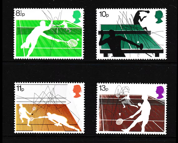
So these were created 48 years ago when no living people could ever be shown on stamps and graphic design was a bit different to what we see today. But the dotted lines showing the movement of the ball are terrible and make the stamps look scored out. The badminton one looks like there are two people on the same side of the net so it's not a great design.
In Memoriam: HM The Queen (2022)

Queen Elizabeth II sadly died in September 2022. It made sense that Royal Mail wanted to create a set to show their respects.
Think of all the possibilities there were. I expected them to create a fantastic set of stamps celebrating the life of of a Queen who reigned for over 70 years. Instead, four of the five stamps from the 2022 Golden Jubilee set were basically re-issued with black borders added.
They're not terrible at all. But in my opinion Royal Mail missed a chance to do something so much better and create a more powerful tribute.
William Shakespeare (2016)

2016 was an important anniversary, as it was 400 years since William Shakespeare died.
William Shakespeare is so famous that everyone has heard of him. He was an incredible man. A playwright, a poet and a man who literally created words. His plays were so great that all these years later every school child in Britain has to read them and answer silly questions about them, like whether we find ourselves identifying with the witches in Macbeth or whether we would want to be friends with Hamlet.
So it made sense that Royal Mail wanted to celebrate him. Here's how I think it went.
"Hey, did you know that 2016 will be the 400th anniversary of William Shakespeare's death?"
"Yes, it is. What do you think we should do about it?" "I'm not sure. But we have to do something. My wife really likes Shakespeare and she'll be mad if we don't."
"Hmmm. Yeah, lots of people like Shakespeare. I dunno... could we like have a picture of his face, maybe the Globe Theatre... what else? Maybe a scene from a play?"
"We have to have 10 stamps, remember. Brings the money in."
"Of course... here, you know what… why don’t we just quote him? People love a good quote. It makes them feel clever."
"Exactly. And he’s public domain, so no royalties."
"Perfect. So… we just need some quotes. Right, I’ll Google 'famous Shakespeare quotes'... Ooooohhh, there’s loads! 'To thine own self be true'… 'Love is a smoke'… 'The fool doth think he is wise'... 'I wish you all the joy of the worm'... actually, maybe not the last one."
"I like it! Makes us sound deep. So we pick ten? Different plays, different fonts."
"Fonts?"
"Yeah. You know… arty fonts. One in gothic, one in something swirly, but make sure there isn't Times New Roman. I hate it. And my teacher said never to use Comic Sans. She was right about everything."
"Sorted. Who needs the Globe Theatre when you’ve got Google?" Again, another huge missed opportunity to do something so much more creative. Which is a tragedy (pun totally intended) as Shakespeare was nothing if not creative.
Modern University Buildings (1971)

Everything was modern once.
These stamps now look very dated and the buildings are of their time. Of course 54 years ago people thought differently about this kind of architecture and that's fine.
But what is so bad about these is that, whatever you think of the buildings, the scenes are lifeless, dull, dead... where are the people? If you like soulless universities then these stamps are for you, but I can't imagine there are too many people who would have these down as their favourite stamps. Some things really don't age well.
Royal Society of Arts (2004)

Here's another set of stamps that could have been much more adventurous. It's the Royal Society of Arts after all! You'd expect something artistic, but instead we got this set.
I think there would have been better ways to tell the story of these great achievements than with white stamps with loads of text.
Changing Tastes (2005)

In some ways I like these. They are bold, colourful and show a multicultural Britain which I think is the real point. But the focus is on changing tastes in food. So, what do we have? An African woman eating rice (2nd), an Indian woman drinking tea (1st) , a boy eating sushi (42p), a woman eating pasta (47p), a woman eating chips (60p) and a teenage boy eating an apple (68p). None of these show changing tastes. Teenage boys have always eaten apples. People from India have been drinking tea for over 800 years. I get what this set is about, but it's picked some pretty bad examples. I think there could have been better ways to show how different cultures have had positive impacts on British life.
Henry VIII (1997)

1997 was the 450th anniversary of the death of King Henry VIII. This was another example of Royal Mail feeling they needed to mark the event while not using any imagination at all.
These stamps are pretty dull because they don’t do anything new — they just use old paintings of Henry VIII and his wives. It feels like the designers didn’t even try to be creative. They could have done so much more with Henry VIII, like showing his power, his palaces, or how he changed history. But instead, they only focused on his six wives, like that’s the only interesting thing about him. It kind of misses out on what made him such a big deal.
The "barcode" definitive (2022)

So much wrong with this!
It looks terrible! And it's not even a barcode, it's a QR code!
The Machin was a classic design and the QR code just ruins it.
Sure, there are reasons Royal Mail introduced these stamps. But they took a fantastic design and spoiled it.
The other stamps on this list are OK - I think they maybe could have been done better. But the "barcode" definitive is by a long way the worst British stamp ever! It really looks awful and I've never met anyone yet who disagrees.
Anyway, these are the Great British stamps I think are the worst. I would be interested in knowing what you think.
A reader called Alan has contacted me, It's always nice to get comments and encouragement! He said: "Dear Xanthe, I have just read your recent articles and felt I must congratulate you. Regarding your Number 1 choice of worst stamp designs - now that definitive issues have QR codes on the side is there any need for a portrait of the monarch as well? Any thoughts?"
Well, thank you for the congratulations.
I don't think there is a need for the monarch's head. Or any picture because the QR code is probably everything Royal Mail needs. But it probably does still need 1st or 2nd printed on it so customers know the value of the stamp. The definitives don't have to have the monarch's head on - and I suppose they have never had to - and could just show landscapes, famous buildings, or something else - but there is a tradition about having the monarch on stamps and I think a lot of people would be unhappy if we no longer had them. I don't think Royal Mail would want to break with tradition - at least not in the near future.


Comments