New Issues: More World Cup Stamps
- Xanthe Page

- 8 hours ago
- 10 min read

I recently reviewed the World Cup issue from Monaco, which I thought was quite good.
I'm taking a look at some other World Cup stamps today, and the first is from Curaçao.
Unlike Monaco, Curaçao actually has a team playing at this World Cup. In fact, it is the very first time they have ever qualified for the World Cup finals and Curaçao is the smallest country ever to qualify. So all in all that's a pretty great achievement and it's no surprise that the country is proud of them, whatever happens in the group games.
Will "The Blue Wave" win the World Cup? That is not very likely. It would be remarkable if they will even get out of their group, which includes Germany, Ecuador and the Ivory Coast. but no doubt they will make people back home very proud and of course the team will help put Curaçao on the map. People who have never heard of the country before will be talking about the team. There are six stamps in the set. The series consists of three themes: players, a QR code, and the matches that will be played.
The WOPA website tells us a bit more. it says: "The players are illustrated as water, symbolizing 'The Blue Wave'. A dark blue background has been chosen as the primary colour, reflecting the colour of our national football's team kit. Incorporated into the design are an abstract wave and, as a supporting element inspired by the Trionda (three waves), references to the host countries where the matches will be played in this case, Mexico and the United States.
"The stamps also feature standard elements such as the yellow stripe on the right and the two shining stars in the upper left corner, representing the flag of Curacao. The second theme includes a QR code which, when scanned, directs Users to a YouTube link featuring the song Blue Wave composed by Aruba-born artist Jeon.
"The third theme focuses on the matches of the Curacao national team. The match against Germany our very first World Cup appearance is presented on a fully gold colored stamp, featuring a gold wave and the Trionda motif. The match details, date, and location are executed in glossy gold foil. The other two matches are depicted on a dark blue background with a yellow band, an abstract wave, and the Trionda motif, with the match details, date, and location also rendered in glossy gold foil."
I have listened to the song and it sounds great. As it is in a language called Papiamento I didn't understand a word but fortunately someone has translated it into English. It starts like this: Today I'm singing for Curaçao
Little country sleeping in the blue water
Since we were small, the dreams are big
Playing soccer behind the house
My eyes are filling with tears
Mum, look where we've arrived
Mum, look where we've arrived
Mum, look.
Look at the balls going into the net
Mum, it's Bacuna who wants to shoot
Mum look look look look
Our boys
It's because of you that Curaçao is number one
Nothing is getting past when Room is in goal
Ay ay, sweet Curaçao, today I'm going to make you show your face
My heart is blue
Brothers have nothing to stop us
We see the blue water in the stamps and we can see this is a country that has arrived and is dreaming big. I love the tune as well. But what about the stamps?
Design Quality - it's solid design based on the "Blue Wave" theme and it works really, really well. As you will know I'm not a huge fan of QR codes on stamps but I will make an exception here because it links to the song and it's hard to put music on a stamp! 8/10
Theme/Subject Choice - If your football team reaches their first ever World Cup finals then you're going to want to celebrate it is mark the occasion with a set of stamps. 10/10
Historical and Cultural Relevance - It's a huge historical milestone for the Curaçao football team and I would say it is very culturally relevant. The team will be making history whatever the results of their games. 10/10
Innovation and Creativity - QR codes on stamps don't normally help the design but the link to the Blue Wave song is brilliant. The Blue Wave design is also very creative. 8/10
Collectability - Curaçao supporters and people interested in collecting football stamps will definitely be interested. 7/10
Personal Appeal - These aren't my favourite World Cup stamps but they're very good. They're very well designed and they tell the story of an incredible achievement. 8/10
Overall score - 51/60

The next stamp is from Armenia. Armenia won't taking part in the finals and so, instead of celebrating their national team, this stamp simply marks the event.
It shows generic players and supporters in the background flying flags from the three host nations - Mexico, Canada and the USA.
Design Quality - This stamp is okay, but it doesn’t really stand out. The football action scene is colourful but it also feels very generic, like loads of other World Cup stamps from the past. The players look a bit blurry and messy, and there isn’t much detail that makes it special or memorable. The background crowd and flags are supposed to make it feel exciting, but instead it just looks crowded and busy. It’s not terrible, but it’s definitely not one of the more creative football stamps out there. 5/10
Theme/Subject Choice - The FIFA World Cup is obviously a huge worldwide event, so it makes sense for countries to celebrate it. But Armenia didn’t qualify for the World Cup, so this stamp feels more like it was made to sell to football collectors rather than to celebrate and it has nothing to do with Armenia’s own football history. Some countries issue stamps like this mainly because they know collectors around the world will buy them. Because of that, the stamp doesn't feel as meaningful as the Curaçao stamps. 4/10
Historical and Cultural Relevance - There isn’t much connection between this stamp and Armenian culture or history. Apart from the country name printed at the top, you could easily mistake it for a stamp from almost anywhere else. It doesn’t show Armenian football players, famous places, national symbols, or anything especially linked to Armenia itself. That makes it feel less interesting from a cultural point of view, especially compared to stamps that tell you something unique about the country that issued them. 4/10
Innovation and Creativity - This is probably the weakest part of the stamp. The design feels very safe and predictable. It’s just another football action picture with flags and crowds in the background. There’s no unusual artwork style, clever idea or creative layout that makes it exciting. 2/10
Collectability - Even though the stamp isn’t amazing, it will still appeal to some collectors especially those who collect football stamps or World Cup memorabilia. However, I don't think it's going to become a highly sought-after classic. 5/10
Personal Appeal - Personally, this stamp just isn’t very exciting. It feels more like a product made for collectors than a stamp with real passion or personality behind it. The artwork doesn’t grab attention, and there’s nothing about it that makes it memorable or emotional. 2/10
Overall score - 22/60

The next stamp is from the USA. The USPS website tells us: "kick off the fun of the 2026 FIFA World Cup with the North American Soccer Forever stamps. The stamps celebrate the long history and rapid growth of soccer in the US. The stamps feature a red-fading-to-blue player, suggesting the role the US is playing in hosting the tournament."
It is interesting that these stamps have been created for the World Cup but don't specifically state it on the stamps. Why not? Everything is "suggested", s presumably the USPS don't have an agreement with FIFA or don't want to formally associate themselves with the event.
Either way, it's definitely a stamp created for the World Cup and that's enough for me!
Design Quality - The design is all right, but it feels very simple and maybe unfinished. The footballer silhouette is bold and easy to recognise, and the red and blue colours clearly reference the USA flag, which is a nice touch. But apart from the colours, there’s very little here that actually says “United States” or “World Cup.” 5/10
Theme/Subject Choice - Because the USA is one of the host nations for the 2026 FIFA World Cup, the subject choice definitely makes sense. Hosting the tournament is a major sporting event, so it’s natural for USPS to release football-related stamps. However, it’s interesting that the design focuses on football in a general way instead of directly celebrating the World Cup itself. There’s no trophy, stadium, mascot, or anything specifically linked to the tournament. It almost feels like USPS wanted to acknowledge football without becoming too strongly tied to FIFA branding or controversy. 8/10
Historical and Cultural Relevance - The World Cup coming to the USA is historically important, especially because football is continuing to grow in popularity there. Even though American football, basketball, and baseball are still much bigger sports in the USA, hosting the World Cup is a huge global moment. At the same time, the tournament has already faced criticism and controversy before it has even started, which makes this stamp slightly interesting in another way. The very neutral design almost feels cautious, as if USPS wanted to celebrate the sport without fully diving into the politics or commercial side of the tournament. I don't know for sure, but is the USPS making a very relevant comment about FIFA? 9/10
Innovation and Creativity - This is where the stamp struggles most. The silhouette design is clean, but it’s also very safe and predictable. There’s nothing especially imaginative about it. Modern sports stamps can sometimes use exciting photography, dynamic layouts or creative typography, but this one keeps everything very basic. It works, but it never becomes exciting. 4/10
Collectability - Because these stamps come from a host nation ahead of a FIFA World Cup, they will probably become quite collectable for football fans and thematic collectors. People collecting World Cup memorabilia or USA sports stamps will definitely want them. However, the collectability comes more from the event itself rather than from the quality of the design. If the artwork had been more distinctive, these could have become much more collectible. 8/10
Personal Appeal - Personally, I don’t find these stamps very inspiring. They don’t really capture the excitement, emotion or energy of the World Cup. For such a huge sporting event, I would have expected something much more creative and dramatic. Instead, these just feel a bit flat and forgettable. 2/10
Overall score - 36/60

Next up is Northern Cyprus. There are two stamps in the set, one showing the official mascots and the second showing famous symbols from the host nations.
Design Quality – These stamps are much more visually interesting than some of the other World Cup stamps I’ve seen. The colours are bright, the gold lettering on the second stamp stands out really well, and both stamps feel lively and energetic. I especially like how the first stamp uses mascots and national flags to create a fun atmosphere, while the second stamp mixes famous symbols and the World Cup trophy together into one image. I think the design of the second stamp feels a little crowded, but overall they look exciting and eye-catching. 7/10
Theme/Subject Choice - The 2026 FIFA World Cup is obviously a huge global event, so it makes sense for countries around the world to produce stamps about it. Northern Cyprus is not involved in the tournament itself, but at least these stamps make a stronger effort to connect directly to the World Cup. The inclusion of the trophy, mascots, stadium imagery and the host countries helps the stamps feel more linked to the actual tournament rather than just football in general. Even so, it still partly feels aimed at collectors rather than celebrating something closely connected to Northern Cyprus itself. 6/10
Historical and Cultural Relevance - These stamps actually do a reasonable job of connecting to the international importance of the World Cup. Northern Cyprus itself doesn’t participate in FIFA competitions, which makes the connection slightly weaker, but the stamps still reflect how worldwide the World Cup has become. 7/10
Innovation and Creativity - These are surprisingly creative. The first stamp uses mascots in a playful way that feels cheerful and modern, while the second creates a collage of famous symbols connected to the host countries. The mixture of landmarks, football imagery and shiny gold text gives the set a bit of personality. They're not masterpieces of graphic design, but at least they try to do something memorable. 8/10
Collectability - I think these stamps will definitely appeal to thematic collectors especially with a strong design. 7/10
Personal Appeal - Personally, I really like these. They feel quite fun and also are very definitely stamps for this specific World Cup. The mascot stamp especially has lots of personality, and the second stamp feels dramatic and ambitious even if it’s a bit over-the-top. They actually capture some of the excitement and worldwide feeling of the World Cup, which is exactly what football stamps should do. 9/10
Overall score - 44/60
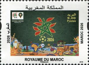
The last one (for now!) is from Morocco. Morocco is looking forward to the finals where they will hope to do well after reaching the final of the African Cup of Nations and winning in controversial circumstances. The big question is whether they will beat Scotland (I hope not!) but this stamp is a celebration of the Moroccan team, which carries the hopes of their nation.
Design Quality - There is a lot going on in this design, probably too much. This stamp has some interesting ideas, but overall the design feels a bit flat and cluttered. The dark green background makes the central logo stand out but the layout is also quite crowded. It’s not too bad, but it doesn’t have the excitement or visual impact you might expect from a World Cup-themed issue. 4/10
Theme/Subject Choice - Football is big in Morocco just now. The team won the African Cup of Nations after a very controversial final and Morocco will be co-hosting the next FIFA World Cup in 2030. Expectations are high for the team to do well, so the subject choice definitely makes sense. 7/10
Historical and Cultural Relevance - The design includes Moroccan-inspired decorative elements and colours, which helps connect the stamp to the country’s identity. It also reflects how important football is across North Africa. Even though the design itself could have been stronger, this World Cup is genuinely important for Morocco. 8/10
Innovation and Creativity - The stamp tries to be artistic, but the final result feels cluttered and old-fashioned. There’s not much movement or excitement in the composition, which is surprising for a football-related stamp. It almost feels more like a tourism poster than a celebration of the World Cup. There was definitely potential for something much more creative. 4/10
Collectability - Because Morocco will be one of the next World Cup host nations, this stamp will probably attract collectors interested in football or World Cup themes. It could also appeal to collectors of Moroccan stamps or African sporting issues. However, I don’t think the design itself is memorable enough to make it especially collectable. 5/10
Personal Appeal - Personally, I think this stamp is interesting but not especially exciting. I like that it connects directly to Morocco hosting the World Cup, which gives it real meaning, and is also distinctly African. But visually it doesn’t grab my attention very much. 4/10
Overall score - 32/60 And that's my latest take on World Cup stamps. I am sure there will be more to review before the tournament kicks off next month!


Comments