


SEPAC Stamps 2026


I have just been alerted to this fabulous presentation pack / folder featuring all the SEPAC stamps from this year.
Some of these I have already reviewed but not all of them, so I thought it would be a good idea if I took a look at all of them so you can see them together. If I have already reviewed them I will just give my score and provide a link the the original post.

The folder contains stamps from the Faroe Islands, Greenland, Monaco, Guernsey, Åland, Jersey, Liechtenstein, Luxembourg and Malta.
SEPAC (Small European Postal Administration Cooperation) was founded in 1994 and each year they issue stamps on a common theme. This year's theme is Iconic Landmarks.
FAROE ISLANDS

The Faroe Islands stamp shows the Skinsin fort of Tórshavn in a miniature sheet.
In 1580, Magnus Heinason built the fort known as Skansin in Tórshavn. In 1629, a brutal raid took place in Hvalba, where pirates killed and abducted several people. To prevent similar attacks in the future, the King of Denmark ordered the Faroese to build a new fort on Tinganes. Later, the Reynafort was built further inland meaning that, for a while, Tórshavn was defended by three forts.
There was a major fire on Tinganes 30 January 1673, which was discovered to be caused by 150 pounds of gunpowder being ignited. How it happened, no-one knows for sure. After the Great Northern War ended in 1721, Denmark became neutral and there wasn't the same need for the forts. Raynafort was abandoned and Tinganes was demolished, but Skansin survived. Since 1901 is has not had any military function but it remains an important landmark and a popular tourist attraction.
Design Quality: The single stamp in a minisheet is a good design and the photograph from the air is able to give us a view of the whole fort. 8/10 Theme and Subject Choice: When you sail into Tórshavn, this is the first thing you see. 9/10 Historical and Cultural Relevance: The fort is a very important part of Faroese history. 9/10 Innovation and Creativity: The photograph and the air and clever use of light bring the fort to life. 8/10 Collectability: All of these stamps are part of a set, which makes them a bit more collectable. But even without that I think iconic landmarks will be popular and this one is excellent. Anyone who has been the the Faroe Islands will know about it. 7/10 Personal Appeal: I like the miniature sheet and the way this combines the historical landmark with modern use like the lighthouse. 8/10 Overall Score: 49/60
GREENLAND

Greenland chose the Sermitsiaq mountain as its iconic landmark. My review on this stamp can be found here. Overall Score: 35/60
MONACO

The Rock of Monaco is Monaco's "iconic landmark". The WOPA website says the Rock is the "historical and political heart of the Principality, crowned by the ramparts of the old town and overlooking the sea, offering an exceptional setting. It embodies the soul of Monaco through its remarkable monuments and gardens. Traces of Phocaean occupation dating back to the 6th century BC suggest that this site served as a stopover for Greek navigators. Since 1297, the Princes of Monaco have established their residence here."
Clearly the Rock is hostorically important as well as home to the modern Royal family. The stamp shows the Rock from the air and we see how huge it and and the hisorical buildings on it. However, I don't think it does justice to just how impressive the rock is. This photograph (below) is taken from a different angle and I think it looks so more impressive here, not just becauise of its enormous size but also the historic walls.

Design Quality: I don't think this is the best picture of the Rock of Monaco! 3/10
Theme and Subject Choice: It is a good theme though - the Rock is very impressive and also very important to Monaco as the Royal Family live there. 8/10
Historical and Cultural Relevance: The Rock has history going back 1500 years and it is definitely an "iconic landmark". 8/10
Innovation and Creativity: It is a stamp that depends on a photograph, and unfortunately not a brilliant one. 3/10
Collectability: It's great as part of the SEPAC set, but on it's own probably nothing to get people very excited. 5/10
Personal Appeal: I like it as part of this set but I would have preferred them to use a different photograph, which shows off just how impressive the Rock is. 3/10 Overall Score: 30/60
GUERNSEY

Guernsey chose the Victoria Tower to be its iconic landmark. My review written in May can be read here.
Overall Score: 46/60
ÅLAND

Åland has done something a bit different from everyone else and has chosen the muesem ship Pommern. Pommern is one of Åland’s best-known sights and a proud symbol of its maritime heritage.
Pommern is the only preserved four-masted steel barque in its original condition. Built in Glasgow in 1906, she first sailed under German flag as Mneme. In 1923, Åland shipping magnate Gustaf Erikson bought the ship and, as S.S. Pommern, she carried wheat between Australia and Europe until 1939.
Pommern has been a museum ship since 1953, Gustaf Erikson’s children donated her to the city of Mariehamn.
Design Quality: I thought it was strange to chose a landmark that is at sea! But it works. The sky is fabulous and Pommern really stands out almost majestically! it's a great photograph and the composition is perfect. It's a really well-designed stamp. 9/10
Theme and Subject Choice: I did think it was an unusual choice and it is different to the other landmarks in the series. But why shouldn't a ship be a landmark? it is important to Åland and it is the only ship of its kind in the world. 8/10
Historical and Cultural Relevance: Pommern has a lot of historical relevance and is now a popular museum. 10/10
Innovation and Creativity: The creativity is all in the beautiful photograph. 8/10
Collectability: There are a lot of collectors into ships and maritime history. 7/10
Personal Appeal: This is a stunning photograph and it is such an interesting subject choice. 9/10 Overall Score: 51/60
JERSEY

Jersey took a look at eight of its local landmarks from the air. My review on this issue is here.
Overall Score: 45/60
LIECHTENSTEIN

Liechtenstein's chosen "iconic landmark" os Schwurplatz "The Place of the Oath". This might not look like too much - it isn't the Eiffel Tower or the Taj Mahal - but it is a place of huge national significance.
On March 16, 1699, the population of the Schellenberg recognised their new sovereign, Prince Johann Adam Andreas von Liechtenstein, on the church hill in Bendern. This oath of allegiance marked the beginning of the political development that led to the creation of the Principality of Liechtenstein. So, basically, the Schwurplatz is a place associated with the country's creation story.

This card shows a view of the current memorial site, which was designed between 1978 and 1980. There is a commemorative plaque in the rock face below the rectory and a fountain designed by the artist Georg Malin. The round shape of the square represents the circle as the original form of assembly. The five-part fountain crown symbolizes the five municipalities of the “Unterland” region or the former Schellenberg domain. Design Quality: The black and white line drawing helps this stamp stand out from the others. It also looks more historical. 8/10
Theme and Subject Choice: I didn't think the landmark was too impressive but when I read about its history I changed my mind! It is a great theme for a Liechtenstein stamp! 9/10
Historical and Cultural Relevance: Can anything be more historically relevant than the place a new country was born? 10/10
Innovation and Creativity: I think the black and white line drawing works quite well as a design but it isn't overly creative. It's a nice picture that represents an important place but there's nothing very innovative about it. 7/10
Collectability: If you know your history of Liechtenstein, I think this have an appeal. But people who don't know the history won't understand its importance. They'll just see a drawing of a house and a well. 6/10
Personal Appeal: I really appreciate the history behind this. 8/10
Overall Score: 48/60
LUXEMBOURG
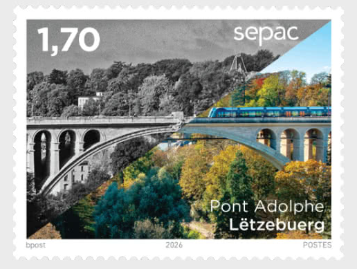
Luxembourg's "iconic landmark" is the Pont Adolphe bridge. This is definitely iconic! I visited Luxembourg a few weeks ago and people absolutely love this bridge. Here is a photograph my dad took.

This photograph and the image on the stamp were clearly taken from near the same spot - you can even make out some of the same trees!
Post Luxembourg says: "the Adolphe Bridge in Luxembourg City is far more than just a bridge. It is a symbol of the capital’s technological and urban transformation. When it was built at the beginning of the 20th century (between 1900 and 1903), it was regarded as an engineering marvel for the time. With its large stone arch, it linked the Ville Haute with the Gare (train station) district, which was then under construction. As such, the bridge became a key structure in the city’s development.
"Recently, the Adolphe Bridge underwent yet another transformation, demonstrating how historic infrastructure can remain fit for the future. As part of efforts to modernise the structure, it was adapted for use by the tram, which plays a central role in the country’s sustainable transport plan. In addition, a separate pedestrian and cycle path was suspended beneath the original deck. Today, the Adolphe Bridge, with its redesign and renovations, symbolises the link between the past and the future: a monument to engineering that continually reinvents itself and is integrated into sustainable and multimodal urban development."
As you see there is a tram on both photographs! It is certainly true that is has been adapted for trams and hundreds go over it every day, but is that what makes the Pont Adolphe iconic? I suspect it might have more to do with the impressive structure!
I have been across this on the tram and walked along the underpass. But the best way to see it is from a distance because then you see just how enormous it is. What you see here is just a small section.
Design Quality: You have the "now and then" split, which is a brilliant idea. You also see the tram going over the bridge showing how its use has changed. The use of colour and black and white to show different eras helps the design. 10/10
Theme and Subject Choice: When I heard about this series I thought Luxembourg would choose either Vianden Castle or the old city fortifications, which are a UNESCO World Heritage Site. So I think the Pont Adolphe is a good choice, but the others are even more iconic landmarks. 9/10
Historical and Cultural Relevance: It definitely has a lot of historical relevance and it continues to evolve to serve Luxembourg's citizens. 9/10
Innovation and Creativity: It is the most creative stamp in this set. 9/10
Collectability: This is where Vianden Castle or the City Walls would have worked better. It's well-known bridge but probably not going to appeal to collectors in quite the same way. 6/10
Personal Appeal: I love the bridge and I love this stamp. 10/10
Overall Score: 53/60
MALTA

There are two stamps in this set from Malta. The 0.50 stamp shows the Xwejni Salt Pans in Gozo, which stretch for approximately three kilometres between Qbajjar Bay and Reqqa Point. The 2.21 stamp, MaltaPost's official entry for the 2026 SEPAC joint issue competition, portrays the Tritons' Fountain, one of Malta's most recognisable landmarks. It is at the gateway to Valletta and millions of people pas it every year. It was built in 1959, which makes it surprisingly new. Here is another photography my dad took. Unfortunately the weather wasn't quite so good on the day we went to Valletta.

The stamp shows the fountain within the church of St Publius in the background. It is also possible to see Antonio Sciortino's Christ the King Monument of 1913, which adds some further historical significance to the scene.
Design Quality: The design lets the landscape in the 0.50 stamp speak for itself. The 2.21 stamp not only shows the monument and fountain but the other historical buildings and monuments behind it. 8/10
Theme and Subject Choice: If you go to Valletta when you see this you just have to stop and look! It really is that impressive! There are other very good alternative options for "iconic landmarks" on Malta but I can understand why they went with this. 8/10
Historical and Cultural Relevance: Not as much historical relevance as you might think, but culturally very important. 6/10
Innovation and Creativity: The photography is beautiful but there is nothing unusual or striking about it. 5/10
Collectability: These are nice stamps that show two amazing landmarks, but do they stand out? 5/10
Personal Appeal: I like these mainly because I have been t Malta. I feel they capture something about Malta's identity. 7/10 Overall Score: 39/60
Not all SEPAC countries participated in this year's "iconic landmarks" series. Ireland, Gibraltar, the Isle of Man and the Vatican City chose not to. I can understand why the Vatican might not have wanted to. The conversation might have gone like this: "What iconic landmark could we add to our stamps? St Peter's Square or St Peter's Square?" "Better go with St Peter's Square. With the Basilica, of course." "But we've done it so many times before." "Yeah, well, that's what makes it iconic." Overall I think these stamps, while being very different, work really well together. The complete folder creates a sense of what makes these small nations so unique while also creating a feeling of being connected. This article contains contributions from Xanthe and Heidi.


Comments